Value Axis Line
Value Axis Line: This video contains how to use value axis line for chart in OPNBI.
![]()
Click on hamburger icon.

Click on visualization tab and open Line Chart in edit mode.

The Edit menu box appears as you click on Line chart icon. And a widget gets added in content place automatically in dashboard.
In Formatting Property click on Value Axis Property.
Enter Following details in Value Line:
- Border Width: 2
- Border Color: #000000
- Border Opacity: 0.6
Fill above details in edit box, As Shown in figure:
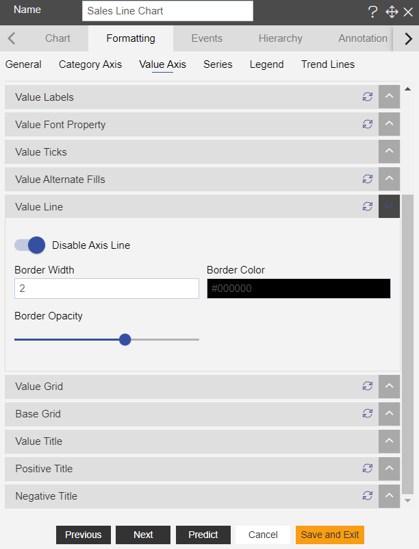
Click on Preview and Save and Exit.
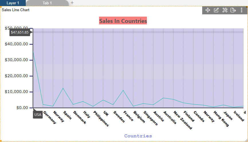
Now, match your Line chart with the below example, it should look like the figure below:
To know more about other Value Axis properties click on below links:-